Performance
Feb 3, 2023
Graph Database Visualization | Graph-Based Analytics and Visualization with NebulaGraph
NebulaGraph
As organizations collect and store more and more data, the need to understand and analyze complex relationships within that data has grown tremendously. Graph databases, which are designed specifically to store and query interconnected and complex data, are uniquely suited to this task. The benefits of graph databases are immense and this explains why they have become a popular choice for many businesses. For example, a graph database offers fast performance on complex queries, making them useful for use cases such as fraud detection, recommendation engines, and social network analysis.
One key aspect that users are increasingly seeking when working with complex data is visualization, as it makes it easier to quickly interpret what their data is telling them.
Let’s explore graph database visualization in particular, the benefits and use cases.
What is graph database visualization?
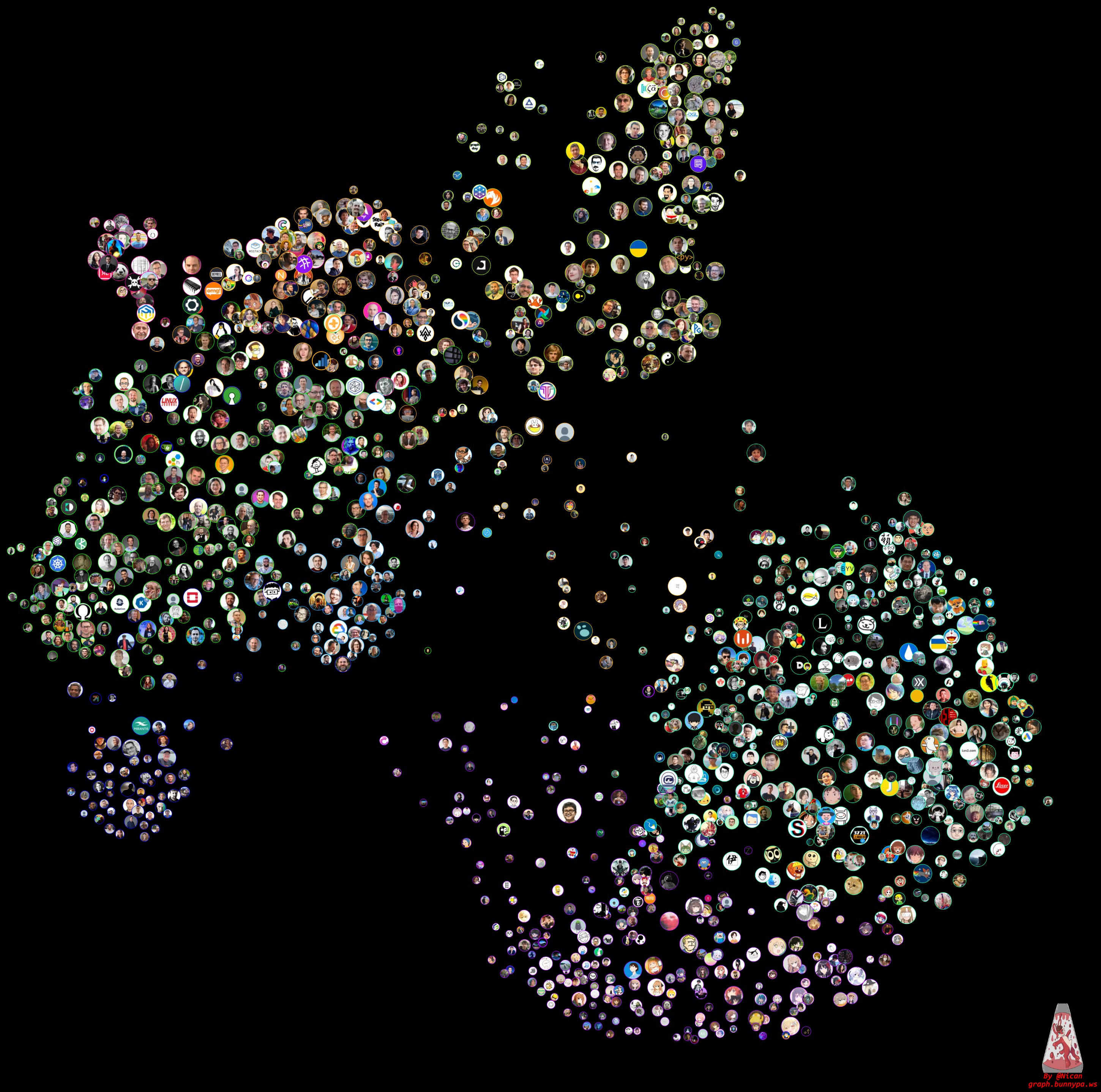
Graph database visualization is the representation of the data stored in a graph database in a visual format, for example a chart or diagram. This makes it easier to understand and analyze the data, because it's easier to see patterns and relationships when they're represented visually.
For example, a social network company can use a bar chart to show how many connections each user has, or a line graph to show how the number of connections has changed over time. We might also use a scatter plot to show how different users are connected to each other, or a network diagram to show how different groups of users are connected.
When you visualize your data in a graph database, it makes your work much easier on many fronts. The structure becomes user-friendly and you gain a significant boost in efficiency when working with the data. We'll tackle the advantages shortly.
How graph database visualization works
To best understand how graph database visualization works, it’s important to briefly go over how data is stored and used in a graph database. We are aware that a graph is basically a collection of nodes and edges, where each node represents an individual data point like a person or transaction, and each edge indicates how two nodes are related; for instance, a person makes a transaction. This data in the graph is stored in a graph database, such as NebulaGraph.
Now, whenever a user wants to retrieve some data, they perform a query. By default, the results of the query normally come in non-visual format such as CSV, JSON, XML, Text Files, spreadsheet, etc. But with visualization, the results will come in a visual format specified by the user - as long as it’s supported by the Graph Database that is being used. Some of the formats can include network diagrams, interactive visualization, heat map, scatter plot, etc.
With this level of visualization, it becomes easy even for novices and non-technical users to understand complex data and make meaningful deductions from it. It means, for example, that a team of data experts can comfortably collaborate on a project with other team members who are not data experts themselves. A business development manager with little data knowledge can make use of such visualization to draw incredible insights that can be used to make valuable decisions.
A graph visualization tool allows you to specify the layout of the display, the color and size of the nodes and edges, and other formatting options. These tools employ algorithms to work out node positions and showcase the data in either two or three dimensional formats. When you interact with the visualized graph, you can zoom in and out, pan around, and click on individual nodes and edges to see more information about them. It’s that simple.
Advantages of graph database visualization
If we had to give a concise description of the many benefits, it would be "enlightening”. Check out this breakdown of the top advantages.
1. Straightforward view
When data is presented in visual format, it becomes much more intuitive and easier to grasp. This is because the brain is naturally better at processing and understanding visual information.
With graph database visualization, you can see the data in a way that is more similar to how you would see and understand the real-world objects or relationships that the data represents.
2. You can easily discover more revelations
Visual data formats allow users to easily find patterns and relationships that may not be immediately apparent in non-visual formats..
The visual appeal of the data also makes it easier for users to explore it more extensively. It encourages users to be more involved with the info, so they'll spend more time there and uncover other perspectives as a result. The fact that the data is visually appealing makes it even easier for them to explore it more extensively - leading to even further discoveries!
3. You can easily explain findings
Graph database visualization allows users to easily share and explain their findings by highlighting important nodes and adding notes or comments.
By adding annotations or highlights to specific nodes, you can can draw attention to trends or patterns in the data and help your colleagues to quickly recognize the insights that you have discovered
4. Friendly for non-experts
Even users who have little or no technical knowledge in data analysis will find it so easy to make use of graph visualization.
Many graph visualization tools are designed to be user-friendly and intuitive, with features such as interactive elements, hover-over text, and filtering options that allow users to explore the data and customize their views.
5. You can zoom in and out
Graph database visualization enables you to zoom in or out and explore the data at varying levels of detail. You can narrow in to pinpoint some areas of the graph or widen your view to observe what it looks like overall.
This can be beneficial when you're attempting to recognize how dissimilar parts of the data interconnect or require finer details. Say, if you're analyzing a large network of people, you could zero in on particular clusters of people to see how they are interrelated or broaden your view to see the complete structure of the network.
Graph database visualization use cases
Any context that requires understanding and analyzing complex data relationships is a good candidate for graph database visualization. Here are some common use cases:
1. Fraud detection and investigation
Fraud is a serious problem that is already having significant consequences for individuals, businesses, and society as a whole. It can take many forms, including identity theft, and financial fraudsuch as investment fraud, insurance fraud, bank fraud, mortgage fraud, and charity fraud, to name a few.
Graph database visualization can help to detect all these forms of fraud by identifying patterns and anomalies in data that may indicate fraudulent activity. It can be particularly useful for identifying suspicious patterns or behaviors, such as consistent trades on the same stocks or unusual money transfers between accounts.
2. Supply chain management
Supply chain management is a complex process with many moving parts. Graph visualization can help supply chain managers to coordinate and optimize many activities and entities in the production and distribution of goods and services.
You can so easily visualize data for example the flow of materials, information, and financial transactions as a graph, enabling you to quickly respond to bottlenecks and identify opportunities for optimization.
3. Cybersecurity
Cybersecurity has become a top priority for organizations in all industries, particularly due to these reasons:
Growing number of cyber threats: There has been a dramatic increase in the number and sophistication of cyber threats in recent years, ranging from malware and phishing attacks, to ransomware and data breaches.
Increased regulation: Many industries are now subject to various regulatory requirements that mandate certain cybersecurity practices and standards. For example, the healthcare industry is subject to HIPAA regulations, which require the protection of personal health information, and the financial industry is subject to various regulations, such as the Gramm-Leach-Bliley Act, which require the protection of personal financial information.
Companies can use graph visualization to address the above cybersecurity challenges in the following ways:
Network security: If you work in network security, try to represent the relationships between different entities (e.g., devices, users, and IP addresses) in your network as a graph and see how easy it is to identify anomalies that may indicate a security breach. For example, if a group of devices that normally communicate with each other suddenly start communicating with a new, unknown device, this could be a red flag and warrants further investigation.
Threat intelligence: Visualize the relationships between different types of cyber threats (e.g., malware, phishing attacks, etc.) and the entities (e.g., IP addresses, domains, etc.) associated with them. Armed with this visual presentation, you will easily understand how different threats are related and how they may be used together in coordinated attacks.
Incident response: In the event of a security breach, an organization can use graph visualization to understand the scope and impact of the incident. Simply represent the affected assets, the entities involved, and the timeline of events as a graph, and you could be on your way to quickly identifying the root cause of the breach. Next is to deploy the appropriate response plan.
4. Knowledge management
Knowledge management is the process of creating, sharing, using and managing the knowledge and information of an organization. It involves capturing, distributing, and effectively using knowledge to support the goals and objectives of the organization. The goal of knowledge management is to improve efficiency and effectiveness by making the most of an organization's collective expertise and experience.
A graph database can be used to represent the relationships between different concepts and ideas in a body of knowledge. Visualizing these relationships can help users understand the structure of the knowledge and how different concepts are related to one another.
5. IT operations management
IT operations management refers to the process of managing the day-to-day operations of an organization's IT infrastructure and systems. This includes tasks such as monitoring and maintaining the availability and performance of IT systems, and managing the configuration and deployment of hardware or software.
One use case of graph database visualization in IT operations management is identifying and troubleshooting issues. IT operations teams can do this by creating a visual representation of the relationships between different components and events. This allows them to easily see how the different components may be impacting each other, enabling them to more effectively identify and resolve issues
6. Drug discovery
Drug discovery is the process of identifying and developing new drugs to treat specific diseases or conditions. This process involves a number of activities, including identifying potential drug targets, synthesizing and testing potential drug candidates, and conducting clinical trials to evaluate the safety and effectiveness of the drug.
Researchers can use graph database visualization to identify potential drug targets by creating a visual representation of the relationships between different biological pathways.
For example, consider a researcher who is studying a particular disease, such as cancer. They may create a graph that represents the relationships between different proteins and genes that are known to be involved in the disease, as well as the pathways in which they are involved. By analyzing this graph visually, the researcher can identify potential targets for new drugs that may be able to disrupt the disease process.
7. Recommendation engines
A recommendation engine is a system that makes personalized recommendations to users by identifying patterns in data. The recommendations are based on the user's past behavior, as well as the behavior of similar users. Recommendation engines are commonly used in e-commerce, media, and social media to help users discover new products, articles, or friends that they might be interested in.
Here are a couple of ways that organizations are putting this technology to work in recommendation engines:
E-commerce: Many e-commerce companies use it to help recommend products to users based on their past purchases and the purchases of similar users.
Social media: Social media platforms often employ this technology to make content or friend recommendations to users based on their connections and interactions with other users.
Media: Media companies can use it to recommend articles, videos, or other content to users based on their past consumption and the consumption of similar users. They use it to identify patterns in data and highlight groups with similar interests.
Gaming: Gaming companies can use this technology to recommend games or in-game items to users based on their playstyles and the playstyles of similar users. It helps identify patterns in data and highlight groups with similar interests.
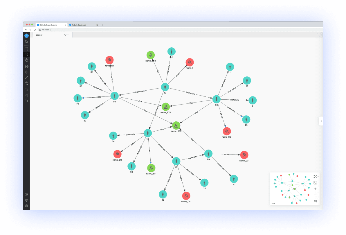
Graph database visualization with NebulaGraph
NebulaGraph offers an intuitive enterprise graph visualization tool known as NebulaGraph Explorer, which is browser-based. You can use this tool in conjunction with the NebulaGraph core to visualize complex interactions in your graph data. As we indicated earlier, you need not be a graph database expert in order to comfortably use a visualization tool, and so you’ll be glad to know that NebulaGraph Explorer is easy to use even for a non-technical user.
The NebuaGraph Manual has all the friendly help you need to get started with this amazing graph database visualization tool - please check it out. Simply go to the table of contents, look for Nebula Explorer and click. Whether you're working in e-commerce, media, social media, or any other industry, Nebula Explorer will help you get the most out of your data.
Conclusion
We sincerely hope you now understand how beneficial graph database visualization can be for anyone working with data, regardless of the level of expertise or technical skill. From subject matter experts and data scientists to analysts, developers and non-technical users - anyone who wants to explore their data and discover hidden insights can benefit from graph visualization.
Finally, it's important to stay focused on the data itself, rather than just being captivated by the aesthetics of the visuals. We say this because it is easy to be mesmerized by the beauty or elegance of a visualization and overlook the underlying data and what it's actually trying to tell you. This can lead to a superficial understanding of the data and may prevent you from fully grasping the trends and patterns that are present in the data. The key is to move beyond just looking at the visualization, and instead really delve into the data points which make it up, while also taking into account any context or questions which it is meant to answer.
